Recently, a certain design approach has taken the web world by storm. Some of the biggest names are embracing it. It is finding its way into blogs, informative sites, web applications, e-commerce etc. This trend, popularly known as ‘Flat UI’Â involves stripping the design of all 3D elements and using only the ‘Flat’ (2D) elements[1]. Thus the third dimension of depth is completely avoided in Flat UI design. Hence shadows are sort of deprecated feature here. Besides, bevel, embossed, gradients, highlights are the other unused features from the previous skeuomorphic approach which was initially endorsed by Apple and later caught the imagination of web designers the world over.
The Basis
Although many of the elements of the skeuomorphic method are not used, the basic aim of the Flat UI is still the same – to convey to the users, the purpose and the meaning of the website in a clear and precise manner.
Now let us have a look at how certain special features help in making Flat UI what it is.[2]
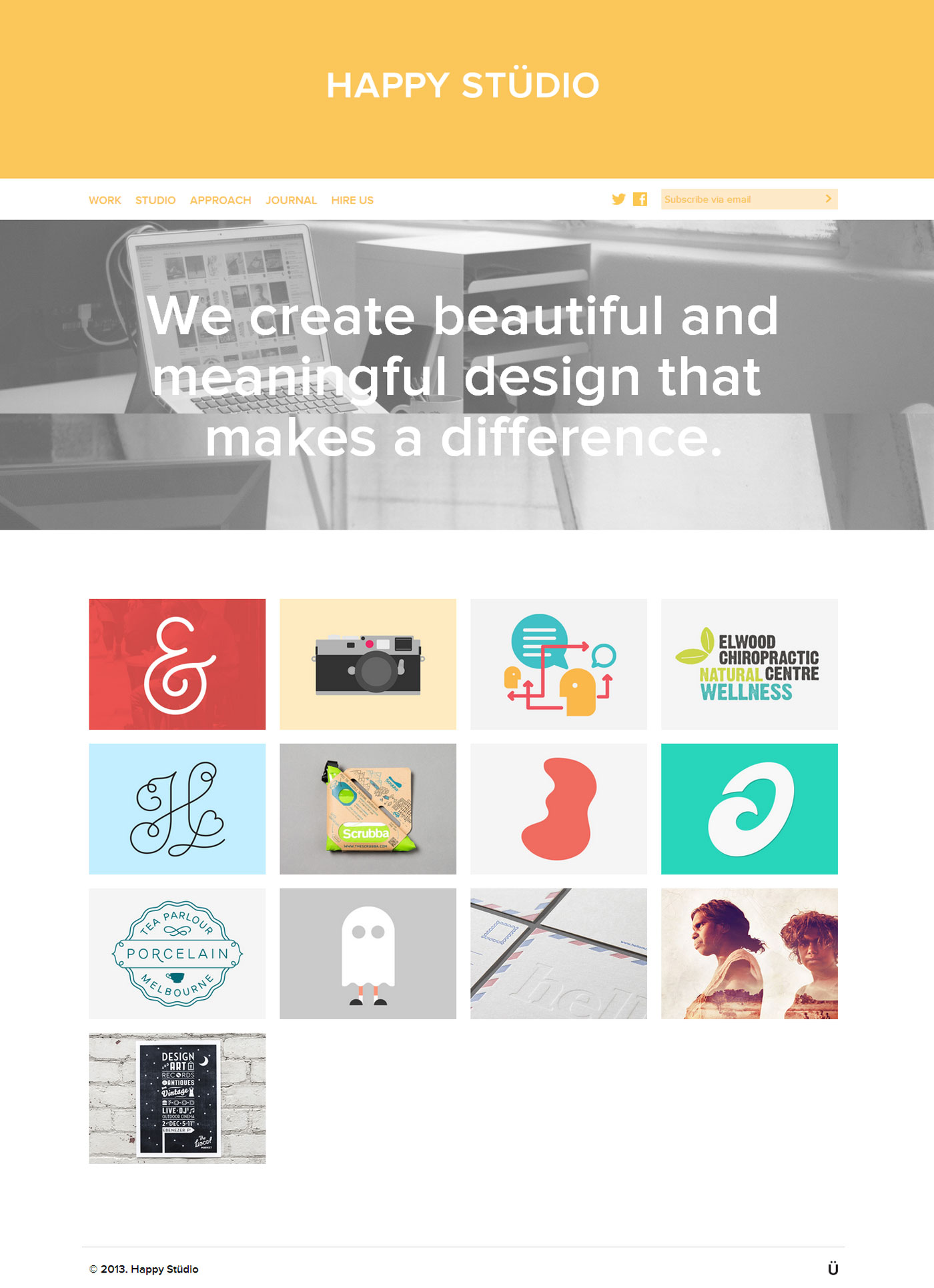
01. Typography
Flat design consists of elements which are simple in nature, as a result of which special emphasis is laid on typography. Flat design uses big sized, bold and effective fonts to convey information. Generally, the font is white, black or grey in color. As Matthew Carter famously said –
“Type is a beautiful group of letters, not a group of beautiful letters.”
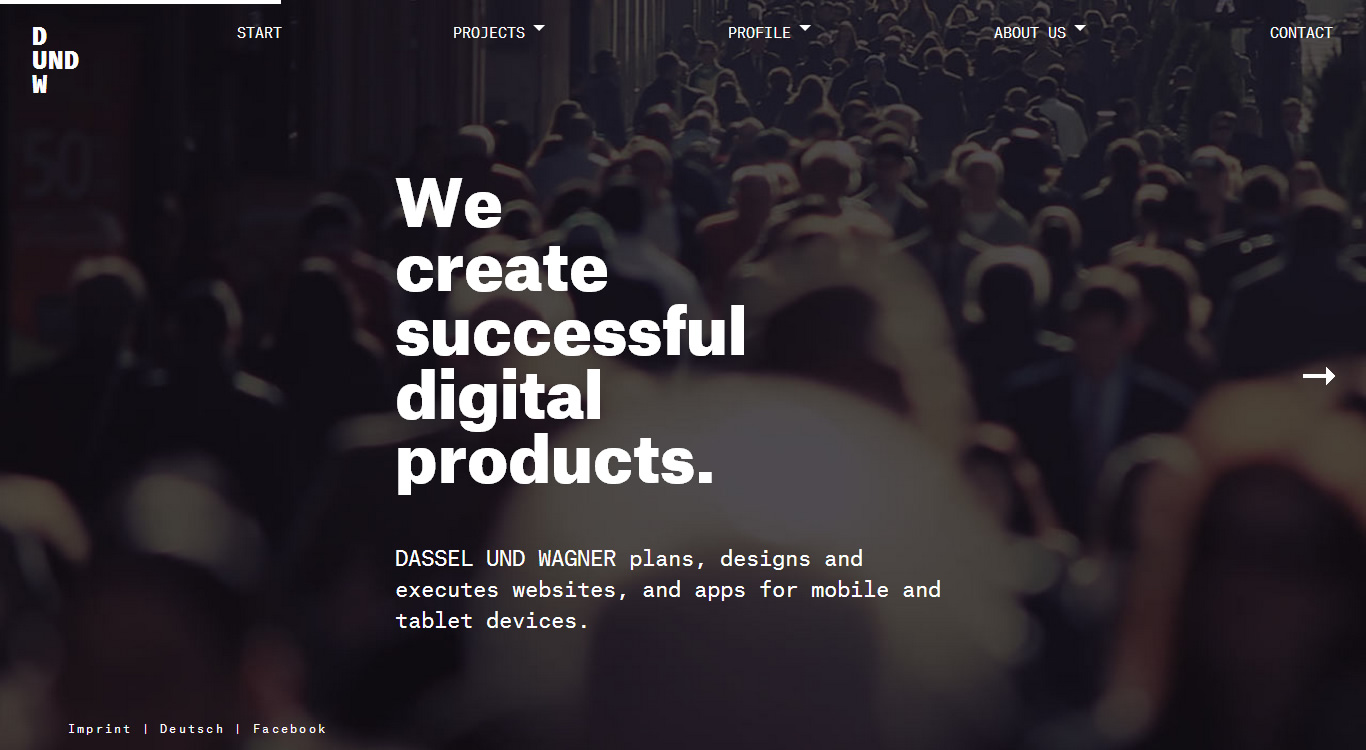
02. Colors
Flat design heavily relies on an attractive combination of colors to convey the idea. Black and white can be as much effective as other color combinations. Primary and secondary colors are popular. Flat UI websites are generally more bright and colorful than their skeuomorphic counterparts. Rachel Wolf has the following take on colors –
“Colour is fun, colour is just plain gorgeous, a gourmet meal for the eye, the window of the soul.”
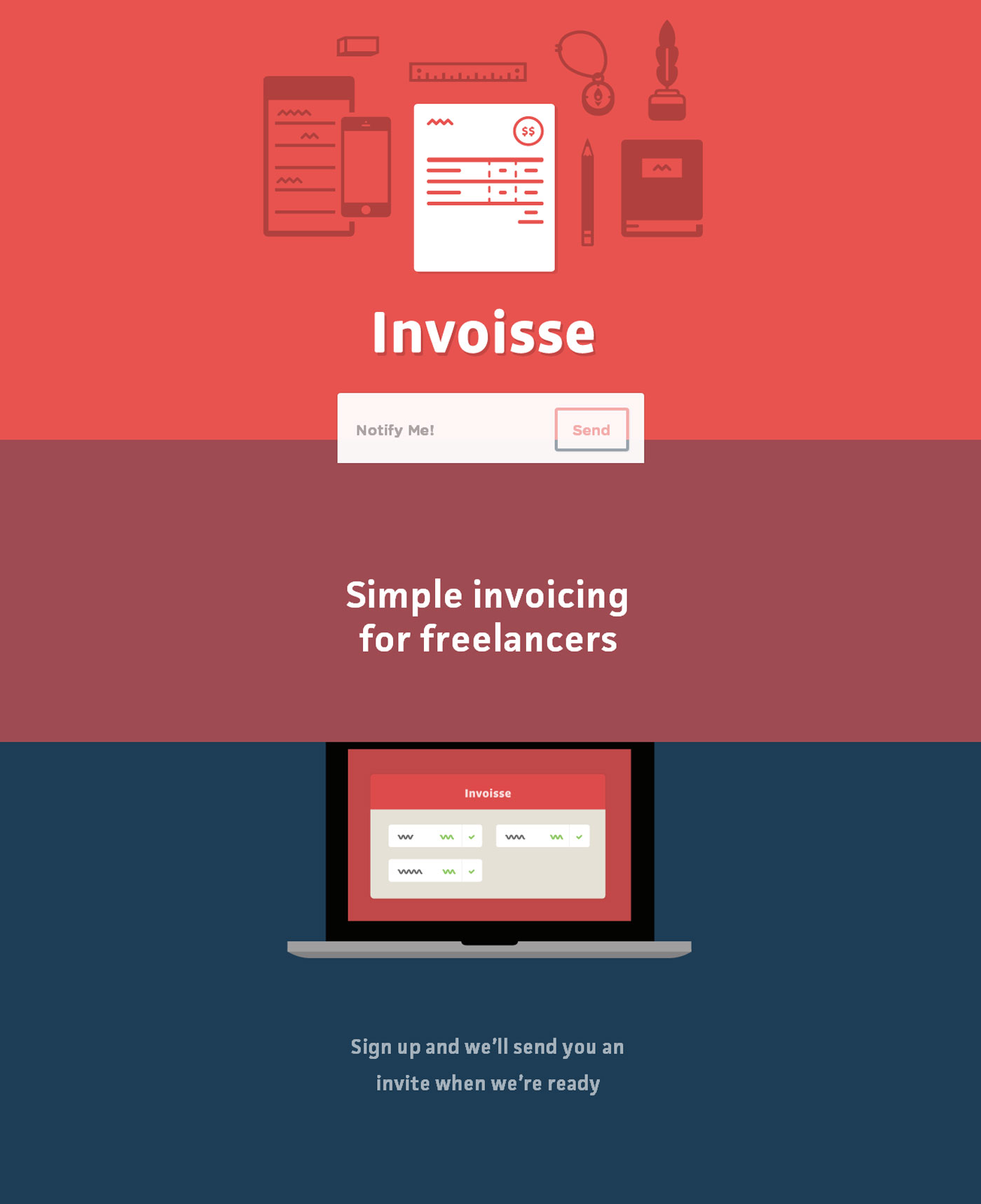
03. Less Visual Noise
Shadows, gradients, textures, bevel and embossed are non-existent. Thus there is a lack of any extra effect. This ultimately makes the elements clear and easy to comprehend. By getting rid of unnecessary visual noise, the content gains prominence and rises to the forefront of the action. Flat UI sites are generally more soothing to the eyes. Besides, lesser effects lead to lighter websites. Now I really couldn’t find any famous quote on why too many effects aren’t always good, so I will try to make up my own –
“Appearance at times can only be an illusion”
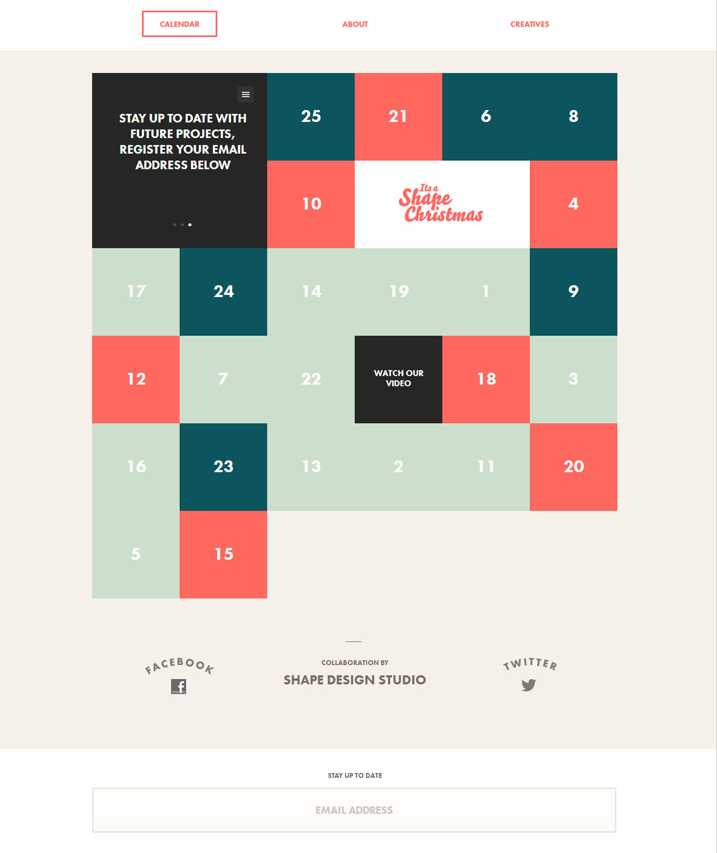
04. Simplicity
All the elements are kept as simple as possible (and two-dimensional). Simple in the sense they are usually square or rectangular in shape, big sized and with little or no animation. Triangular, circular or some other complex shape may be used too. Shape edges can be perfectly angular and square or include curvature. Flat design follows a famous quote by Leonardo Da Vinci,
“Simplicity is the ultimate sophistication.”
The Shortcomings
As it happens with every other trend in any industry, chances are the internet might suffer from the overuse of flat design as designers might start using it even if the project does not demand it.[3]
Designers in the quest of having a minimal approach often end up getting rid of a lot more elements and content than what is necessary and the usability of the project suffers.[4]
Besides, users have formed a habit of seeing certain elements in a certain manner and hence a design where all elements are at the same level and follow similar approach might create confusion in the minds of the users.[5]
A Tweaked Approach
One never expects Google to follow the rest of the world. In the case of this new trend too, Google is trying to create its own space. Google, for majority of its services, uses a style of design what is now being termed as ‘almost flat'[6] or ‘skeuominimalism'[7]. From Gmail to Drive to YouTube, this approach is very much visible. It tries to incorporate the best of both the ‘skeuomorphic’ and ‘flat’ approaches. A close observation reveals how Google uses shadows and gradients but in a very subtle and impressive way.
However ‘MySpace’ and ‘Facebook’ have followed suit and are some of the other famous sites which have embraced the ‘almost flat’ design.[6]
The Final Word
Is flat design here to stay? Well, one can never be sure. It’s a trend like, skeuomorphism was (or rather still is). But slowly, the latter is making its way out. May be, a few years down the line, Flat UI will have a competitor and suddenly will have more shortcomings than ever. So for now, let us embrace it with open arms and make the best, proper and fitting use of this beautiful concept of Flat Design.
References
1. Showcase Of Beautiful Flat UI Design
2. Principles of Flat Design
3. The Battle Between Flat Design & Skeuomorphism
4. Why I’m No Metrosexual
5. Flat UI is not the only way forward
6. Almost Flat Design
7. Skeuominimalism – The Best of Both Worlds